Tuesday, November 27, 2012

More Goines, Please.


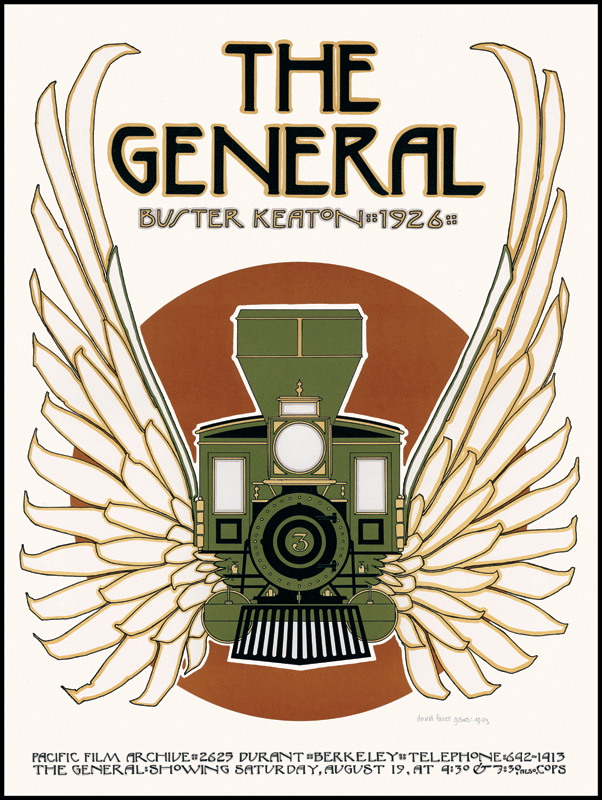
This week my attention was captured by the image of a train with wings and a short paragraph about a man who was kicked out of UC Berkeley at age 19, apprenticed with a traditional printing press and later bought the shop when the business went bust (Meggs', 459-450).  This man is named David Lance Goines and his poster design for a screening of the Buster Keaton classic film The General seemed to merge elements of Plakatstil with Art Nouveau, two of my favorite styles.  I was hooked and needed to see more than our text provided.  And I needed to know what happened to him after launching the Saint Hieronymous Press and find out if he was still running it.  As it turns out, the press is still running strong and has made quite an impression in Berkeley over the years.  And he apparently has an amazing mustache!


Goines is perhaps most widely known for his several decades of successful poster art, including the series promoting classic film screenings.  His work has been reproduced in numerous publications, exhibited internationally, he has authored several books and he lectures frequently. Over the years he has created works for many local businesses, most notably Chez Panisse restaurant, for UC Berkeley, and many wine labels, a few of which I have personally enjoyed without ever knowing the artist behind them.  I especially enjoyed his comments regarding the ATF rejection of his original label design for Kenwood.
Despite their name, they do not exist to promote these things, but rather to protect us from all three, preferably by eliminating them altogether. This design was originally done for Kenwood Winery as a wine label, but the ATF ruled that (and I quote) "the drawing of the young lady must be deleted. More specifically, the Bureau regards the picture as 'obscene or indecent.'"

OK. No naked dames. They said it would be acceptable if we put a black bikini on her. I didn't like that idea. Since we finally got them to admit that it was the skin, the naked skin, that offended them, I redrew the design and eliminated the skin. We then resubmitted Kenwood's label with a recumbent skeleton on a vineyard hillside. After a bit of hemming and hawing, the ATF rejected that design, too. Some song and dance about fetal alcohol syndrome. Hard to deal with an agency that can just make up rules as they go along.
The full story, including the ATF approval 20 years later, is available on his official website.


I also really enjoyed getting a glimpse into the mind of Goines through this interview with Collectors Weekly. 
I don’t collect posters. I don’t collect anything. I started making posters one at a time by hand in high school just for specific events, basically got going when I was a freshman. I still make them today, but they’re printed on a printing press now. I’ve made 221 posters, not including the ones I did in high school. Fundamentally, I believe that in order to be effective as opposed to artsy and not really effective at all, a poster has to be extremely simple.
His humble description of what he does and how he does it is refreshing, and I find truth in his belief in the necessity for simplicity in poster design.  He also shares some of his inspirations, thoughts regarding fine art vs. graphic art, and commentary on other contemporary design work.

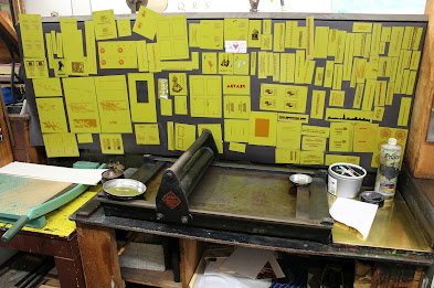
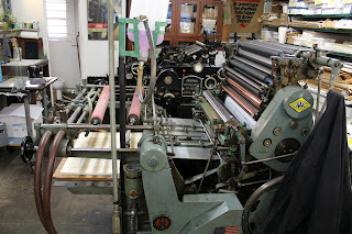
Today Goines still runs St. Hieronymus Press and continues to print using traditional letterpress and photo-offset lithography techniques on an assortment of presses from the 1800s and early 1900s.  According to this article in Oakland Local, Goines designs his posters using the following steps:
  1. Draws the design by hand.
  2. Traces the design on tracing paper and transfers it to a linoleum block.
  3. Carves the design into the linoleum block.
  4. Creates a print from the linoleum, and then scans the print.
  5. Uses Photoshop for some final processing, similar to how he used to use a dark room.
  6. Transfers the image back onto either an offset die or a letter press die, depending on how many colors the job requires and the size of the image.


Resources:

Wednesday, November 21, 2012

Great Ad Campaigns, why so great?

Reading about the "Think Small" advertising campaign for VW caused me to immediately draw a parallel to the Apple "Think Different" campaign.  And this got me thinking, besides the similarity in the slogan between these two, what made them such effective campaigns?  And what made some of the other greatest campaigns of the twentieth century so effective?  So I decided to pull a couple "top 10" lists out of Google and do a little exploration into the why behind some of the greats.  Disclaimer:  I make no claim that my selections here presents a conclusive list of the greatest campaigns of all time, only that these are all contenders and some of the one that are personally interesting to me.


Lets start with the campaign that solidified Bernbach's reputation, the little car that could.  This campaign was up against quite a lot, at the time American cars were big by definition and Americans simply didn't buy small imported cars.  Bernbach had to overcome market prejudice, and they did this by taking it head on with honesty and cleverness.  They positioned the product as unique and turned a shortcoming into a selling point and carved out a very nice market niche.

Apple: Think Different - Bill Bernbach

Apple took a very similar note with their Think Different campaign.  In the 1990s Apple was suffering from lackluster performance and a significantly diminished brand image.  With a simple and quirky slogan and a tribute to some of the greatest independent thinkers in history, this campaign greatly revived their counter-culture image.  One of those immortalized in this campaign was Bill Bernbach himself, which I thought was a nice nod to the VW campaign.


A post discussing advertising campaigns wouldn't be complete without referencing a beer slogan, so lets get this out of the way, "Tastes Great... Less Filling" echoed through a generation (or two?) running from the early 1970s into the 2000s.  Miller Lite hit a gold mine with this one, thanks to the ad agency McCann-Erickson Worldwide.  The challenge here was similar to the problem VW faced, there was a market prejudice against light beer, a belief that it didn't taste good and that it wasn't masculine.  They confronted the notion that it didn't taste good with the comedic tug of war between between fans preferring the taste vs. the low calories, and used a wide array of sports heroes and celebrities to change the non-masculine prejudice.


Lets get real simple here... milk, do you have any?  Practically every California resident knows this question well... hell, sometimes I stop and ask myself this for no good reason at all.  The primary challenge here was to combat declining consumption and the campaign was met with rapid success, within the first year California saw a 7% increase in consumption and the trend held steady while on the national level milk consumption continued to decline.  And beyond simple sales success, this campaign has to be responsible for the largest number of spin offs and internet memes of just about any ad slogan, and what true measure of success do we have in this age of the internet if not the prevalence of memes?  Got memes?


I couldn't end this post without a little controversy, so what about one of the most iconic brand mascots of all time, the good ole' Marlboro man.  This campaign is now as hated as it was successful, launching it's product to be the most widely smoked brand of cigarette in the world.  The message in the various advertisements was inconsequential to this campaign, it was all about the man.  The Marlboro man represented the American cowboy, he radiates masculinity and nostalgia to Americans and everything stereotypically American to the rest of the world.  And ironically, this is one icon that came back to bite the hand that fed it when David McLean, who appeared appeared in the 1970s as the Marlboro man, later developed emphysema, became an outspoken ant-smoking advocate and eventually died of lung cancer.


References:
Top 100 Ad Campaigns of the Century - Adage.com
Top Ad Campaigns of the 20th Century - CNBC.com
Best Ad Campaigns of All Time - Infographic
10 Greatest Marketing Campaigns of All Time
Tribute to Apple Think Different Campaign - Creative Criminals
Volkswagen ad campaign was far from a lemon - Silicon Valley / San Jose Business Journal
Got Milk? - A Case Study

Wednesday, November 14, 2012

Parody as Fair use? Matter knows what time it is.

While searching for images of Herbert Matter's work, I stumbled across this article discussing a Swatch advertising campaign that reused/recreated some of Matters famous pieces for the Swiss National Tourist Office.  This got me thinking about the fine line that is often walked when parody is used in advertising and how relatively common this practice appears in advertising.

Matter original on the left
In this side by side comparison we can see that the Swatch ad appears to use the same background image with a recreated foreground image of the head wearing the visor and a new arm with watch inserted.  To anyone familiar with the original, the connection will be obvious.  But there is enough change in the piece to set it apart as a parody rather than a duplication.  And according to the article, the artist working on this Swatch campaign, Paula Scher, contacted Matter's estate and Matter was credited in the work.  In many parodies this is not the case.

 
In some cases it may not be a specific work of art that is parodied, but a very distinct artist's style.  In the below examples we see Lipton and Volkswagen clearly capturing the style of Salvador DalĂ­.  Since no work is being exactly copied, this seems like a much less risky form of parody.  Only the style is being used so no copyright laws come into play.


On the other end of the spectrum is the parody where the original art, or a large portion of it, is recreated and added to or superimposed with other imagery.  This is still seen quite commonly, but seems like a much more risky use of the concept of parody as fair use.  A choice examples here are this advertisement for a dating service using da Vinci's Mona Lisa and this ad for a cleaning product using Botticelli's The Birth of Venus.


I suppose no discussion of parody in advertising would be complete without mention of the image most reused in advertising,  da Vinci's The Last Supper.  This image has been used in advertising of everything from restaurants to rat poison.  Even the SF Folsom Street Fair, a leather fetish festival, which is probably about as far from church approved as you can get.


Resources:
Parody or Plagiarism, by Paula Schrer
Advertising inspired by Famous Painters, at designer-daily.com
Marketing Masterpieces, at owni.eu

Tuesday, November 6, 2012

Bringing back Plakatstil, or Hosmer as a modern day Bernhard

One of many topics we covered in this week's reading was Plakatstil, the style that emerged in early 1900s Germany, also known as Poster Style.  This style immediately captured my attention as I recognized it's influence in more modern works I have admired and I was pleased to be introduced to the work of Lucian Bernhard and his contemporaries.  But a few of the examples of Bernhard's work looked especially familiar, and it took me a little thinking to make the connection to a local artist who's work I greatly admire, Santa Cruz local Steve Hosmer.

Hosmer runs a sign shop, Stokes Signs, which produces a wide range of signage for local businesses ranging from the more standard to quite unique and abstract.  But he has also created quite a large collection of poster art which I would argue is Plakatstil reincarnate.  My favorite of Hosmer's work is a collection capturing various Santa Cruz landmarks in Plakatstil style, a few of which I am sharing here, the full portfolio can be seen on the Stokes Signs website.


In these Designs we can see the trademark elements of Plakatstil, and Bernhard's influence specifically.  The use of flat illustration and bold colors, a heavily simplified composition often reduced to a single symbolic image.  The text content is also minimal and uses a very bold stylized typeface.  I am a huge fan Plakastil and other styles that share elements of bold graphic simplicity, although I was not familiar with the proper name for this style previously.  The use of bold colors and minimalist composition has significant graphical power and is very effective at grabbing attention and communicating an idea, emotion or the essence of a brand.  The end result is also incredibly visually pleasing.


With a little Google research, I confirmed that Hosmer has credited Lucian Bernhard and Ludwig Hohlwein as his greatest artistic inspiration.  Hosmer's poster for Omei restaurant is a beautiful homage to one of Bernhard's most famous poster designs, his contest winning design for Priester.  The essence of the Priester design is echoed through use of the same color scheme, red/yellow/blue on black, the same basic shape of the matches is carried over to the chopsticks and the typeface is recreated.  And it's hard to see in the resolution of the photos available online, but even Hosmer's signature is a subtle tribute, in a similar typeface and with the name split in half and stacked in two rows, HOS-MER just like BERN-HARD.

Left: Hosmer, Right: Bernhard
I enjoyed learning about Lucian Bernhard this week and I was glad to stumble into this connection revealing an insight into the inspiration of a modern artist I greatly admire.  I applaud Steve Hosmer for reviving this beautiful style of illustration.  And I hope to soon enhance my wall real estate and personal inspiration space with a few works from both of these artists.


Links:
Interview with Steve Hosmer
Stokes Signs official website
Lucian Bernhard, wiki page
Ludwig Hohlwein, wiki page